Identity & branding
Creative direction · Graphic design
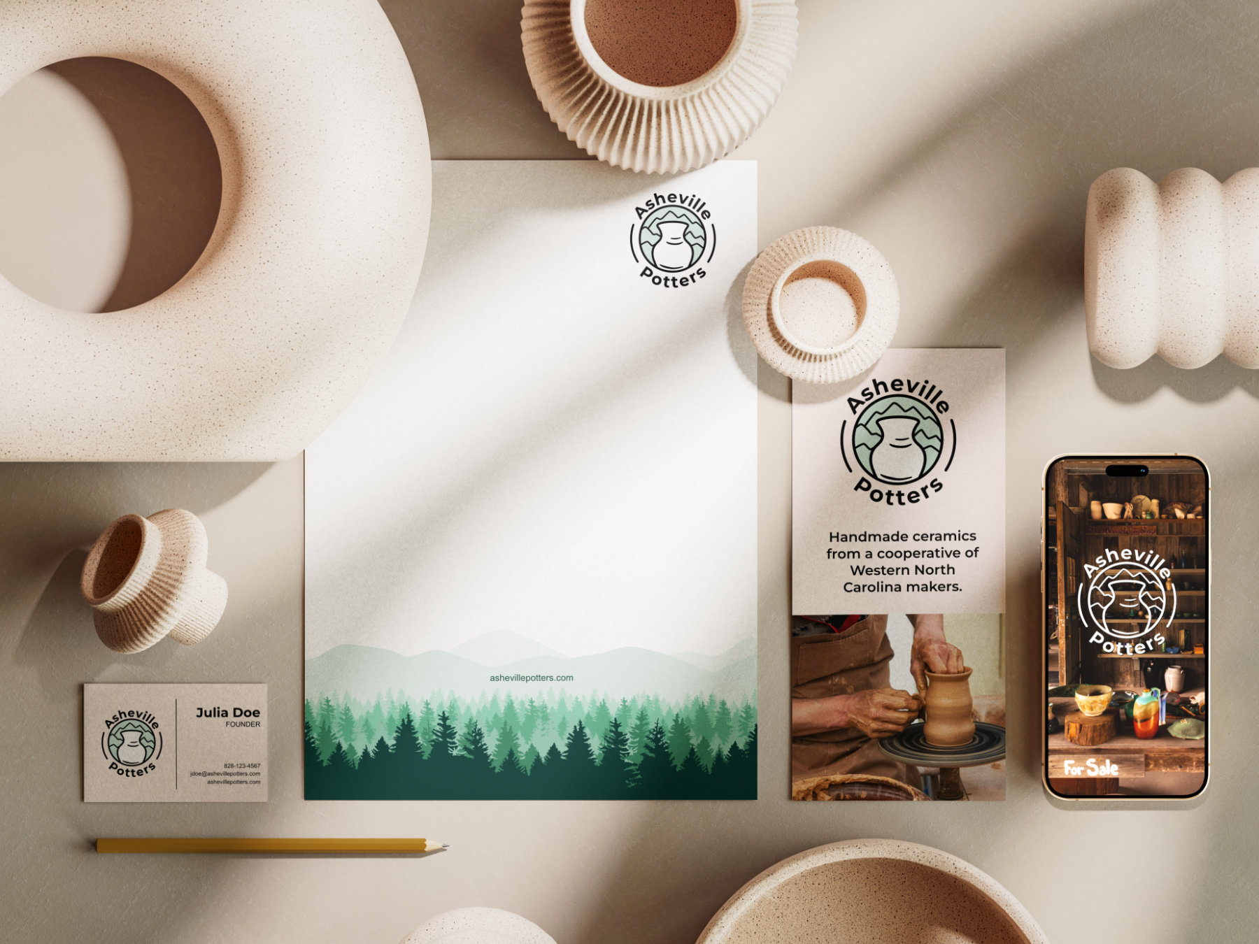
Asheville Potters Branding
Logo Design · Identity · Stationery
Asheville Potters is a member-owned community of ceramic artists who share resources, costs and responsibilities. By pooling their talents and funds, potters can access retail opportunities that would be too expensive to manage alone.
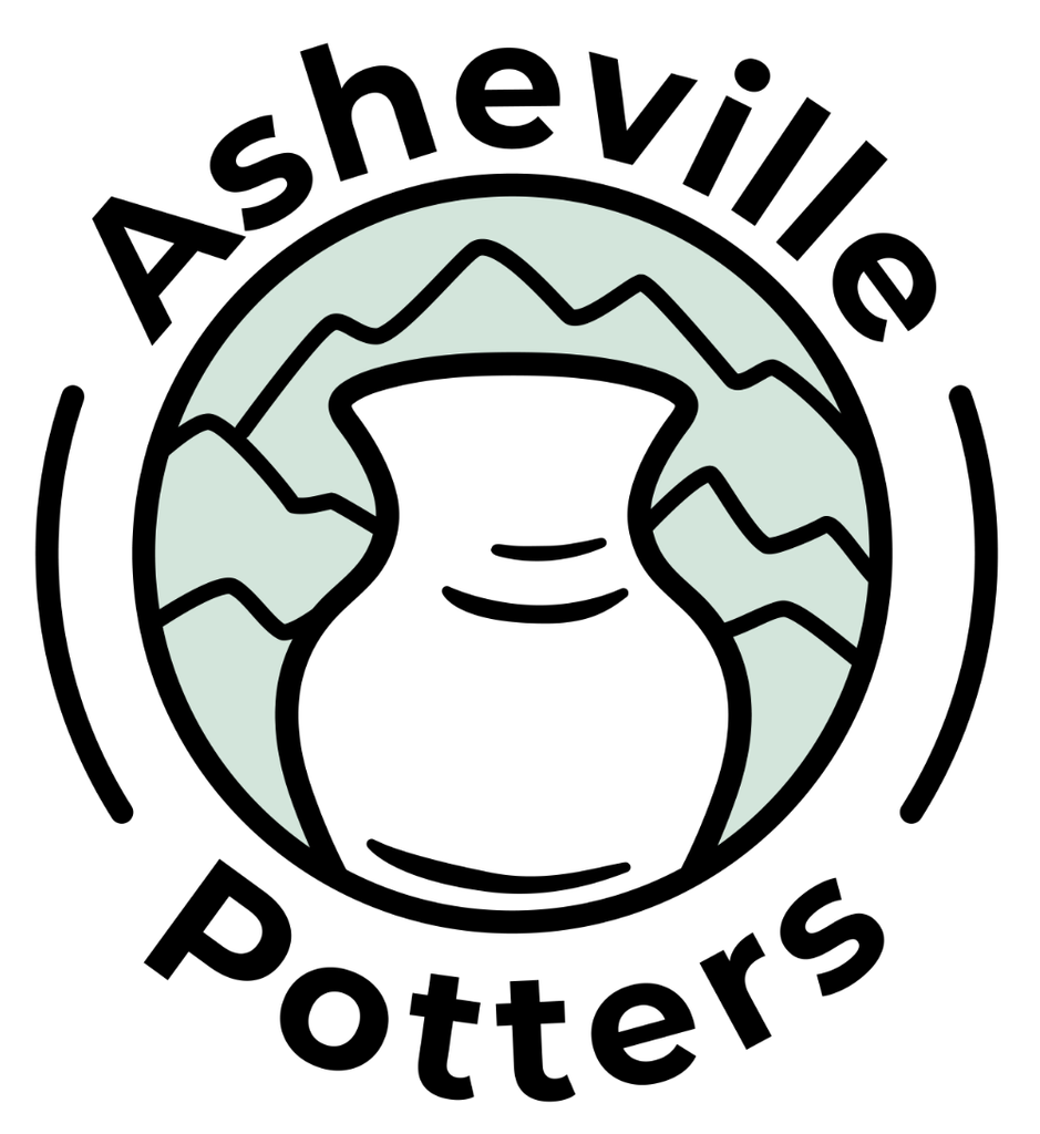
I started with the two of the things that say Asheville Potters best: a wheel-thrown pot and the Blue Ridge mountains. The pot sits in front of the mountains, drawn with a thick, rounded line that feels handmade and friendly. The soft sage green keeps it calm and earthy, and the name wraps around the circle like the stamp a potter presses into the bottom of a piece.
Custom Logo Designs





My approach
A good logo is several small decisions
Listen first. I start with a creative brief and a conversation about what the company stands for and who they are trying to reach. I look to understand how they want their audience to feel, and then let that feeling guide every choice after it.
Find the one idea. I sketch a wide range of ideas and keep going until a few feel original and fit the brief. Those are initiated in black and white so that the conversation stays focused on the concept and not the color to ensure I’m on the right track.
Sweat the small stuff. Typography and styling decide whether a logo feels friendly or serious, handmade or polished. I pay attention to every detail, take a step back, and try to view it from the audience’s perspective. Once the design is more refined, it’s time to introduce color.
Test it in the real world. Before anyone sees a final version, I check that the logo holds up tiny on a screen and large on a sign, and on light and dark backgrounds.
